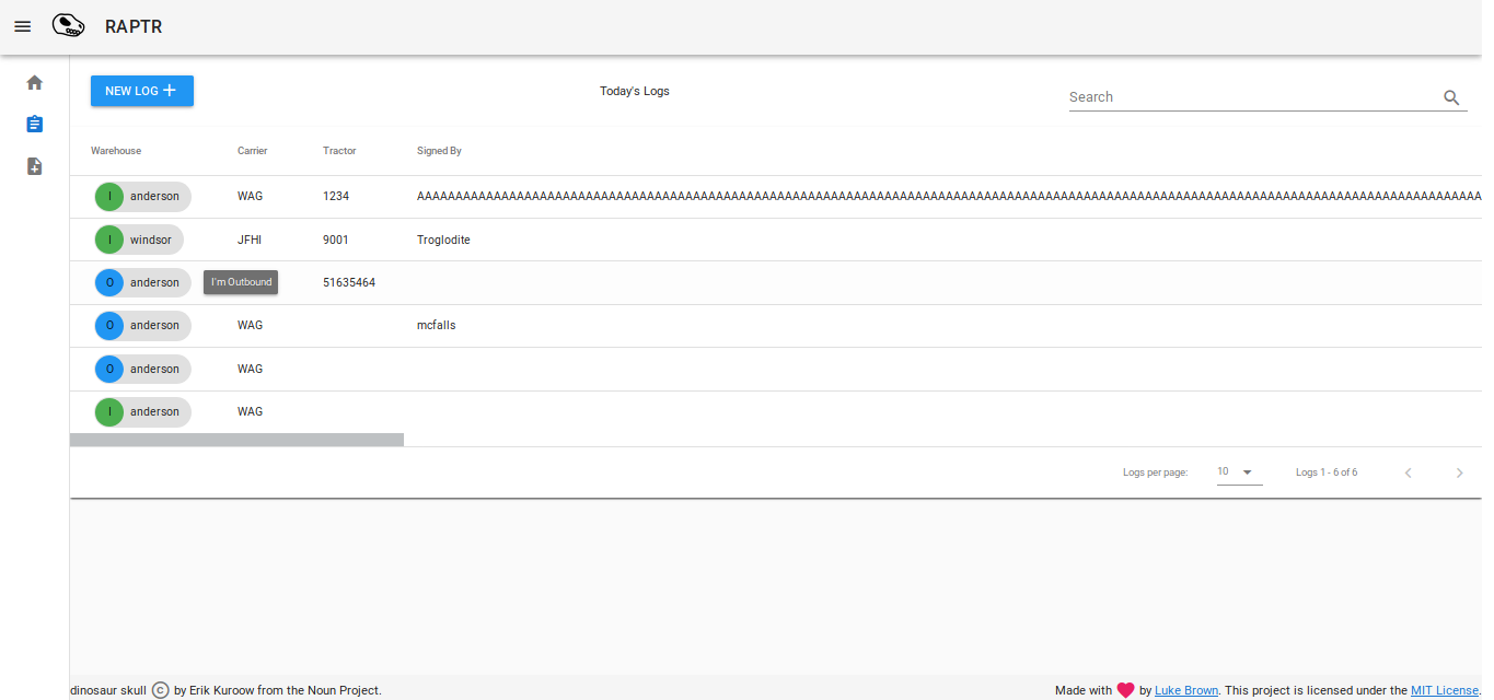
So I did a bit more tooling, and with the current layout, there is no need to search for warehouse when you can sort by warehouse and then display as much as you need.
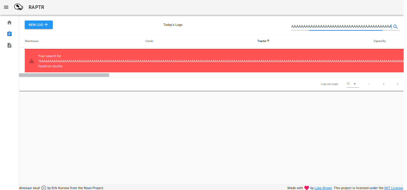
The search does not go one level deep into sub components text properties, it just evaluates strings if they are present. I.E, does not search the text inside of a tag.
I’m going to try and bind some values in my search model to the value of the pop inside my main component state. So when you search, the props inside the tag are still not searchable, but they are mirrored to a value inside my state which the search function can parse through.
So for a little overhead it should be able to bring searching back.
Fixed the time issue. There is an issue where the initial state of my time objects needs to be null and can’t be an empty string '', at mount. After which it becomes a string and can be empty. :s
I like the new menu, is a great addition and works well on my phone. Also the dialog for charging time on mobile is great now that its a pop out box that scales the screen (the old one is still there under it) and the number only input for Route Number. Other than that I noticed that the new log entry doesn’t scale as well as before on mobile and you can’t scroll through on the log page so I can only see warehouse, carrier and tractor.
I was playing around with different breakpoints to try and get a better mobile experience. Guess thats still WIP xD
It will definitely still be a focus, but now I really need to get the last core features complete so I can roll out a 1.0. The desktop/tablet experience is where my focus is at right now since that’s what actually going to be using this app.
Also i had a thought. For the records thing. Defaulting to yes/no might be a bad idea because someone might forget to click the correct one so it might not reflect the right one. So why not have the yes/no be blank and show something like a yellow symbol when its not answered?
Yeah ahah I’m still working on the form, but I decided to tackle the UI issue first. You can have the best form in the world but if its not seamless with the UI then no one wants to use it.
Why have defaults to yes you might ask? Well, ordinarily I’d just leave it all empty. But for this specific use case, it is better that they are the default. The project goal was to save time and increase productivity. Quite literally, 99% of the time, the defaults are the defacto input for the majority of logs for common carriers. When I conducted my research I examined months worth of data from spreadsheets to come up with these.
My rationale was: “why waste time typing redundant info, just record what is different/what matters”. This allows them to focus on the data that changes with greater attention.
I’ve actually had them use the form and timed them with my app vs with paper. A user who is competent at typing is about 10-15 seconds faster at entry, and response time to finding issues is now half of what it used to be.
For my next feature to really seal the deal, I’m going to implement advanced searching for past logs. Something was done all by hand by going through cabinets and would take hours. My goal is to get that down to just a few seconds.

 The new UI is a vast improvement overall, I like the responsive design and scaling works perfectly on every device I’ve tried it on so far.
 yay. I’ve been doing many refinements.